***Competition Time***

Hey all!

It’s competition time!

Ive got a one page web site, 1 years domain name & 1 years hosting up for grabs absolutely FREE!!

Just pop over to my facebook page http://www.facebook.com/MattGilbeyWEB and share me about until I have over 50 page likes.

Then leave a message on my wall using the hashtag #comp.

You have till the end of May to achieve my 50+ like goal!

To be successful the lucky winner has to officially like my page and leave a #comp message on my wall.

Good luck everyone!!!!

Matt
MGWD
http://www.mattgilbey.co.uk

New Dogs… Old tricks!

Well this week has been an annoying one to say the least. I’ve been spending time doing a new website for a client and everything was going smoothly until I suddenly noticed that one page would move to the left about 10px for some unknown reason.

I spent many a hours every night going through all the CSS and HTML to see where I had made this peculiar error. To my horror I’d sent myself into a wild goose chase. I first realised that the said page this would happen on is the only page where the content was greater than height of the window itself. Secondly I then realised that the scroll bar would appear on the browser window when only that page was loaded, because naturally the content was able to scroll past the height of the window.

Then….. Boosh! …..that little cartoon light-bulb appeared above my head. That 10px it moved to the left was about the same width as the scrollbar that would appear, could these 2 things be connected?

Hmmmmmm!

After much confusion and self doubt to whether or not I was on to something or not I then realised in order to stop this little issue I could do one of two things:

1. Ignore it and let it be or 2. Make every other page think the window was full of scrollable content without their actually being any.

I decided for the love of design I’d go for option 2!

Now if you find yourself with this embarrassing issue and are too afraid to ask anyone, especially after realising what such a school boy error you had made then look below,and don’t tell anyone!……………shhhh!

All you need to do is add this to your body CSS:

#body {

overflow:scroll;
min-height: 101%;

}

Hey presto a magical scrollbar appears on every page thus rectifying this problem and making sure nothing moves.

This should also be compatible with every browser there is far as I’m aware, but if not let me know!!

Anyway hope this has or will help you at some point!

All the best

Matt

: )#

Use the filters boy…use the filters!

CSS3 Filters have added such a great dimension to web design. Now we can apply those great effects without the need of images and their loading time. Or even apply those filters to images already present in the design. Something that makes filters truly flexible.


Such filters as blur, saturate, contrast, invert, sepia, invert, hue-rotate and grey-scale and more are all now available with a short bit of CSS3 code. Lets not forget these can also been combined!


Now I could blabber on for hours about how to use them, which looks good and what doesn’t but that would bore me half to death and I’m sure you wouldn’t be too happy either! So I’m going to share with you the exact same link that I used to learn some of these filters. I learned a great deal from it so I certainly hope you do to!

http://net.tutsplus.com/tutorials/html-css-techniques/say-hello-to-css3-filters/

Another great tutorial by Jeffrey Way!


See you soon….


Matt

: )#


@font-family


Today I thought I would share a mini tutorial on how to embed a font on a website. This can ensure a consistent look and design to a website and doesn’t rely on all your viewers having the same font, which can end in tears as that nice lovely font you used gets turned into Comic Sans!

#The first step is to go find a font you like and want to use.

#Next you need to make sure you can legally use this font for your project!!

#Once all that is out the way you need to head over to www.fontsquirrel.com and press the @font-face generator link and follow the instructions.

#The generator will take your uploaded font and create a zip file which has multiple copies of your desired font in different formats so that every browser will be able to support your font.

#Also within this file you will get a CSS file. You can either link to this file separately or take the styles and place them within your current CSS file you currently using.

The code will look something like this:

@font-face {
font-family: ‘CoopLightRegular’;
src: url(‘cooplight-webfont.eot’);
src: url(‘cooplight-webfont.eot?#iefix’) format(’embedded-opentype’),
url(‘cooplight-webfont.woff’) format(‘woff’),
url(‘cooplight-webfont.ttf’) format(‘truetype’),
url(‘cooplight-webfont.svg#CoopLightRegular’) format(‘svg’);
font-weight: normal;
font-style: normal;

In order for this to work you will need to change the lettering in BOLD and remove the apostrophes and then direct this to your own font on your web server

e.g.   src: url(fonts/cooplight-webfont.eot);

The last step needed is to use the name of the font in this case; ‘cooplight-webfont.eot’ (including the apostrophes) within the CSS styling of your desired DIV.

e.g.

#main-content p {
font-family: ‘CoopLightRegular’;                                                                                           font-size: 12px;
color: #000                                                                                                                                                   }


Hopefully this has helped explain how to use the great @font-face feature. If not get in touch I would be happy to help further!


Until next time…


Matt

: )#


960 Grid

The 960 grid isn’t something I personally use much. I have done but now tend not to use it. I thought I would explain the 960 grid system and even show you some examples/tutorial of how to use it.


So here goes……

“The 960 grid system is a tool that helps uniform a web design by providing equal spaces and dimensions so that all div, images etc are of equal proportion to the page”

Quite a mouthful I’m sure you’ll agree! So lets simplify it and try and explain it with a bit more ease.


“The 960 Grid System is an effort to streamline web development workflow by providing commonly used dimensions, based on a width of 960 pixels. There are two variants: 12 and 16 columns, which can be used separately or in tandem” – 960.gs

“The 12-column grid is divided into portions that are 60 pixels wide. The 16-column grid consists of 40 pixel increments. Each column has 10 pixels of margin on the left and right, which create 20 pixel wide gutters between columns” – 960.gs

“The premise of the system is ideally suited to rapid prototyping, but it would work equally well when integrated into a production environment. There are printable sketch sheets, design layouts, and a CSS file that have identical measurements.” – 960.gs

960.GS is a fantastic website full of information regarding the 960 grid system, I suggest you go check it out, it’s well worth a read!


And while your there why not download the 960 grid system PSD? and have a play around?


see ya soon


Matt

: )#


Lynton & Lynmouth

Hey guys,


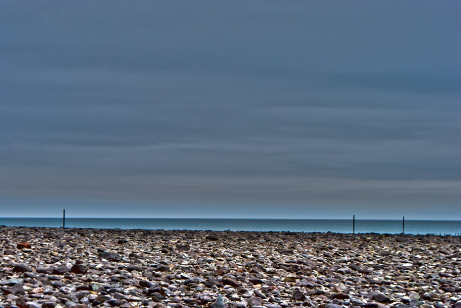
This weekend I whisked my girlfriend off to Lynton & Lynmouth in North Devon to see her Nan and meet up with her Mum, Dad and relatives. The weather wasn’t excellent but I managed to take a few snaps.

I decided I better share them with you all, so enjoy!

ImageImageImage


Image

Image ImageImage


Hope you’ve enjoyed looking at them as much as I did taking them.


Until next time…..


Matt

: )#

Howdy!

Well what can I say?

Firstly thank you for popping by to take a look and having the time to do so.

You’ve probably managed to find your way here through a link from my site www.mattgilbey.co.uk which means you already probably know a bit about me and my work.

If you don’t then let me quickly fill you in. I’m Matt Gilbey and I’m from a town in Warwickshire called Nuneaton. I have designed websites for a while now but recently I decided to give myself a kick up the back-side and showcase my talent to the world. Hopefully this will create even more creative work for me.

I shall be popping my thoughts, design ideas and even the odd link to other people’s blogs here for us all to enjoy and hopefully learn from.

Once again, thank you for popping by!

Matt